Friday, July 31, 2009

Kitchen: Before and After

Our Kitchen "Before":

I thought about painting the cabinets, but several people pointed out that, even though they are knotty pine, they are solid wood. So we left the cabinets unpainted.


Don't you just love the little houses on the border in the backsplash?? If you love that, then you would have been even more thrilled when I tried to rip it down and determined that under it was PAINTED WALLPAPER, then MORE WALLPAPER under that. Brett and I first tried just scoring it and spraying on wallpaper remover gel, but eventually we moved to a garmet steamer and had much more success.
There is Brett coming into the kitchen during the home inspection. The floor was also a keeper--ceramic tile in a neutral color. I have always wanted a black and white tiled kitchen floor, but alas, it was not meant to be!
Here you can see the wonderful bay window/breakfast nook area with the icky burgandy gingham window treatments. I just have something against the country-crafty home decor scheme after growing up in West-by-God VA. Really like the stained glass ceiling light fixture though. Sorry about the blurry photo! I would also like to draw your attention to the dark woodwork trim which, in my opinion, made the whole room look dated and dreary.


Our Light-Filled "After":
My friends Laura and Louise came down to help me paint while Brett was having a golf weekend with his guy friends. We extended the green, Benjamin Moore's "Harbour Town" on the long wall from the family room, and painted the rest of the kitchen walls yellow, Benjamin Moore's "Mellow Yellow."


Later Brett and I painted the windows, trim, and moulding BRIGHT SHINY white, with the help of his parents who were visiting from Vermont. (Benjamin Moore's "Frostine." I also made over the window treatments by taking down (with relish!) the valances and re-doing the roman blinds. (Expect a post on that DIY later on!)

You can see in this one how we painted the crown moulding white up to the cabinet soffits, and then left the moulding touching the cabinets the same color. We thought it made the cabinets look more like they extended to the ceiling, and also gave the room some lift and brightness where it needed it. It took 3 coats on the trim--that was pretty time intensive. We also gave the doors a fresh paint since the "white" that was on them looked more yellow and dirty with the pretty new trim next to it.


Our fabulous, wallpaper free backsplash!!!


We decided to leave the cabinets as-is for now...even if they are knotty pine! I wish I knew what to do about the drawer pulls--what kinds of looks do you think we should get? Nickel? Ceramic? Glass? Metallic? Colored? The kitchen is definitely not modern, but I think the paint and new blinds made a big difference in brightening up the space, especially the white trim. We also could use an update with appliances and countertop. I have been playing with the idea of concrete countertops--does anyone have any thoughts on that? How do you like the makeover?? Too matchy-matchy? Or just cheery and perfect??Thanks to everyone who helped us get this project done!

Thursday, July 30, 2009

Jacaranda Otami Textiles


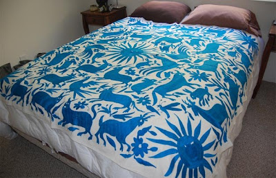
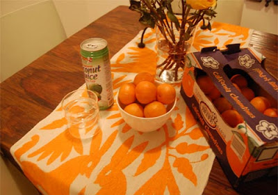
These textiles from Jacaranda are amazing. I want to upholster my couch in one of them, like this one in royal blue, but I don't know if they are available in the yardage I would need.

It seems like they are made individually so I don't know if one would match the other in terms of dye color or in terms of pattern. I LOVE that they are handmade in Mexico by Otomi Indians, and I love that each one is different. Despite the fact that they are not available in yardage for upholstery, they are created especially for many different specific purposes such as table runners:

wall hangings:

and bed spreads:

LOOK at the vibrancy of that color. I want to know if they dye their own fabric, and who the people are that make these beautiful textiles. Its almost like the suzani trend, but I think fresher. You could get a bedspread of course, and make it into smaller things like pillows. What do you think about this fabric? Where would you put it in your house?

Monday, July 27, 2009

Asian-Inspired Asparagus Recipe

This is my absolutely favorite way to eat asparagus. My friend Pamela taught me how to make this in high school, and I have been making it ever since. This makes a great side dish with practically anything: salmon, pork chops, steak, or even shrimp. It's SO EASY, enjoy!

Asian-Inspired Asparagus
1 bunch asparagus
1 teaspoon diced garlic
2 teaspoons olive oil
1 teaspoon sugar
1/4 c soy sauce, plus more to taste
1. Cut off the tough ends of the asparagus spears, and cut the remaining tender part into 1-2 inch sections with the ends at a 45-degree angle.
2. Heat olive oil in pan and saute garlic until slightly golden
3. Add asparagus and cover pan, stirring occasionally, until asparagus is tender. (approx. 5 mins)
4. Mix sugar into soy sauce, and add mixture to pan. Toss until asparagus is coated.
5. Remove from heat and enjoy!

Lolly vs. The Beach

Last weekend we make the trek (FINALLY) up to the Eastern Shore and Chincoteague to celebrate our one year wedding anniversary. More on that later. We took the pup with us, and decided she needed to experience the beach! At the suggestion of the innkeepers at the Bed and Breakfast, we took her to the calmer Chesapeake Bay side of the beach so she wouldn't be too scared of the surf. You have to understand that going into this, we knew she refused to go in the baby pool and acted as though we betrayed her when we tried to get her into the James.

Here we are on the way... ("Mom where are we going?? What are you doing?? Can I sit on your lap??")


And upon our arrival...("What the heck is this place? Don't even try to put me in that water, sicko.")


We did throw her in twice.

She ran back out immediately.

("Hmm its windy here and smells kind of good.")


And then we buried her ball in the sand... ("I can dig all I want here and don't get yelled at!!!!!! Scccorreee! Dig Dig Dig Dig Dig Dig Dig Dig Dig Dig Dig Dig Dig Dig Dig Dig Dig Dig")

Brett and Lolly running back to the car. *sigh*

More about Chincoteague later, but this was just too cute to hold out!

Friday, July 24, 2009

Intake Register Redo

This what our intake register looked like when we moved in. That is our home inspector, once again doing what home inspectors do while I take photo after photo of the house! This dirty off-white monstrosity was original to the house (as we learned from touring several neighbors houses) and drew attention to itself since it contrasted with the dark stained knotty pine paneling. But I had a vision!


After we moved in, the room got TOTALLY redone--refinished floors, paneling and trim painted glossy white, and I wanted to replace the industrial ugliness. I looked into buying a decorative cover, but the size is large and everything I liked was around $300. WAAAAY too much for me. So I took it upon myself to design a decorative trapdoor-type intake register cover.

First I searched high and low for this decorative screen that looks like what decorative radiator covers are made from. I wanted a pretty perforated look, whether metal or wood or plastic, that I could paint a glossy white to match the new white trim and paneling. The overall idea was to make a mitered frame out of molding and put a decorative screen in it like a picture in a frame.

Here is an article from This Old House that details how to make a radiator cover where I found a lot of sources of decorative screening.


I finally found some at Lowe's. Let me tell you, however, that it is called EXTRUDED METAL and NO ONE who works there knows what you are talking about when you ask for it. Here are the options at lowes:

This geometric one,

This one that looks like caning:


and finally this cloverleaf pattern


I wanted to find something that would let enough air through so as not to block the intake for our air, but that would block the view into the hold underneath the stairs. I ended up going with the cloverleaf pattern, which fit that balance and also is a classic pattern for our colonial style house. (I'm not going to lie, it also kind of reminds me of the Van Cleef & Arpels Alhambra collection!) They come in pretty large sheets, plenty big enough for me to make my 20 x 20 inch square.

The next step was to pick out the molding to make the frame. Lowe's and home depo have good selections of basic molding like picture molding, chair rail, dental, etc, but if you want something more elaborate like egg-and-dart you might have to go to a specialty store like Woodcrafters.

I ended up with some pretty basic but still decorative crown molding that went with the molding already in the room. Next I needed to get something to help me saw perfectly 45-degree angled mitered corners because we don't have a table saw. I got a miter box and saw at Lowe's for under $10, and the saw has come in hand multiple times since then on other projects! Thank you to my mathematically talented hubby for doing all the marking and calculations for the cutting part!


So then I assembled the basic register cover by cutting the screen to slightly larger than the 20 x 20 hole (I made it 21 x21) then cutting the four sides of the frame from one really long piece of molding. The moulding was large enough so that it extended beyond the screening by about an inch. I then used my handy-dandy staple gun to staple the screen to the back of the glued picture frame! I picked out some cheap little hinges and hooks...


...and spray painted EVERYTHING white!


Voila! Here is the finished project! It hinges out so that we can store paint cans inside the area under the stairs, and blends into the woodwork MUCH better than the other ugly thing. It also, I like to think, adds just a little bit of individuality to the room in a subtle way.


So pretty! Do you all feel the same way I do about the old intake register? Has anyone else tried a project like this one?

Wednesday, July 22, 2009

Painted Stripes Inspiration and Such

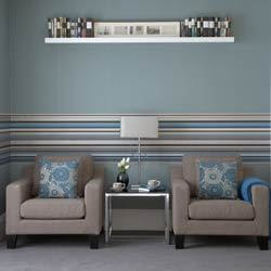
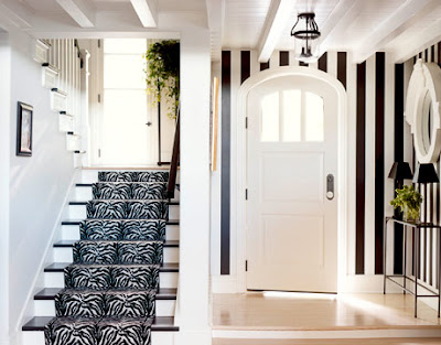
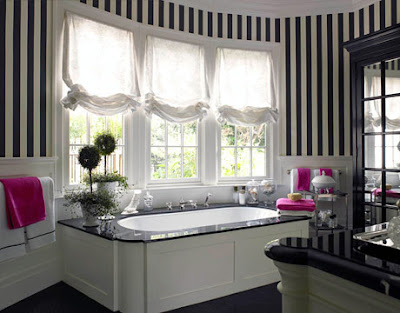
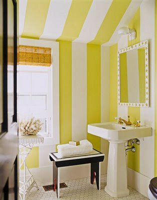
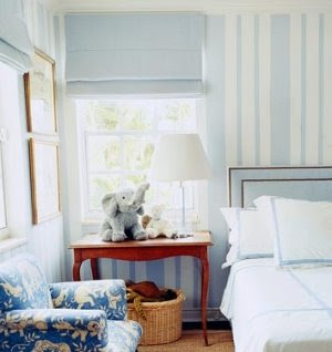
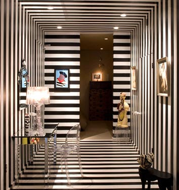
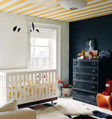
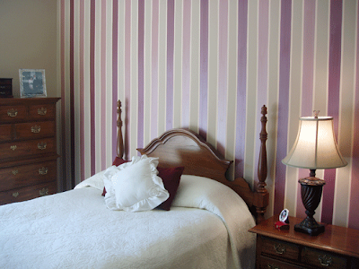
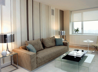
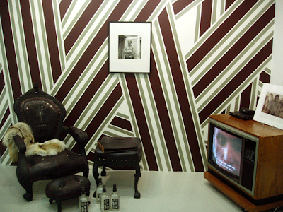
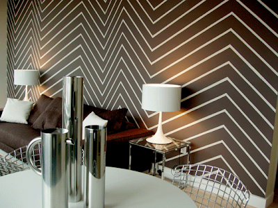
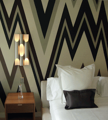
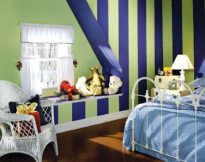
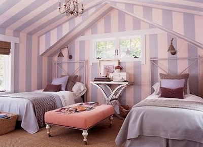
Brett and I are currently contemplating painting the office, the stairway, and the mudroom with some sort of stripe. He wants the theme of the office to be Duke Blue and white, while I am thinking toffee colors for the stairway and blues for the mudroom. Here is my collection of images we are looking to for inspiration on direction, spacing, and placement of the stripes. This first one is my FAVORITE (duh, its yellow and white!) by far, but I don't think I have a place where it would work. More after the photos:


Yellow vertical Stripes
(House to Home)

(via My Home Ideas)
(via Ideal Home)

pink and orange horizontal stripes
(Sheldon Mendel Assoc. via Casa Sugar)

(via House to Home)

(via House Beautiful)
(via Domino Magazine)

(via Domino Magazine)

(via Domino Magazine)

(via Domino Magazine)

(via Apartment Therapy)

(via Apartment Therapy)

(via Apartment Therapy)

(via Apartment Therapy)

(via Apartment Therapy)

(via Apartment Therapy)


(via Apartment Therapy)

(via Apartment Therapy, a "during" photo of the previous photo)
(via Apartment Therapy)
(Katy Elliott via SwishyandSwanky)
(via HomeScape)

(via HomeScape)
(Anne Coyle via ThePeakofChic)
I am thinking for the mudroom, if I DON'T go with beadboard then I will work with some vertical stripes in light blue and do the ceiling like the light blue one above from house beautiful. The ceiling is really high in there so I think it would be beautiful!

For the stairwell, I am already playing with a toffee/latte/caramel color scheme, so maybe a neutral tone-on-tone or same-color-different-sheen diagnonal stripe or zig-zag.

For the office, I am liking Duke Blue and White stripes gathered in the center of the room like the autumn-colored dining room above from Apartment Therapy. Or maybe some horizontal "faux chair rail" stripes?

Definitely more on these projects later on as they materialize...

What do you guys think?